The question
Stock prices move sharply when a company reports earnings. That is well known. The question I wanted to answer is whether those moves can be traded systematically, and more specifically whether being selective about which companies you trade around earnings actually helps.
Anyone can buy every stock before it reports. The interesting question is whether filtering those trades by the quality of the company improves the outcome, or whether it just feels like it does.
I built a full research pipeline to find out, and then I hosted it so I could keep testing new versions of the strategy.
How it works
The system pulls its own data. It connects to a financial data provider and ingests company profiles, earnings dates, historical prices, stock splits, share counts, analyst estimates, financial statements, and insider trading activity. Each of these lives in its own module so a change in one data source doesn’t break everything else.
Every earnings event gets scored across six factors. Valuation, growth, profitability, momentum, analyst revisions, and insider activity. Each factor is scored on a common scale by ranking a company against everyone else rather than against a fixed threshold, then the six are blended into one composite score. That way a score means the same thing in 2015 as it does in 2024.
The scores only use information that existed at the time. This is the part that quietly ruins most backtests. If you score a company using financial statements that were not published until after the earnings date, your strategy looks brilliant and is completely fake. I used point in time joins so every score reflects only what was actually knowable on the day of the trade.
The backtest simulates a real portfolio, not a spreadsheet average. It holds a limited number of positions at once, enters and exits on configurable windows around the earnings date, applies a 0.2% transaction cost to every trade, and supports stop losses. Capital is finite, so a trade you take is a trade you cannot take somewhere else.
What I found
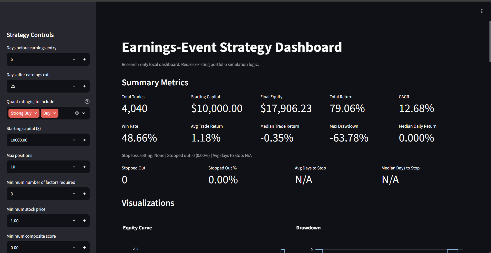
The headline number is positive, and it is not evidence the strategy works. The run above turns $10,000 into $17,906 across roughly five years of trading. A 79% total return looks like a result. Every number underneath it says otherwise.
The return is a 12.68% CAGR bought with a 63.78% drawdown. The account spent most of the test period underwater. It fell by more than half early on and did not recover its starting capital until the final stretch of the window. Nobody sits through that, which means the compounded figure at the end is not a return anyone would actually have collected.
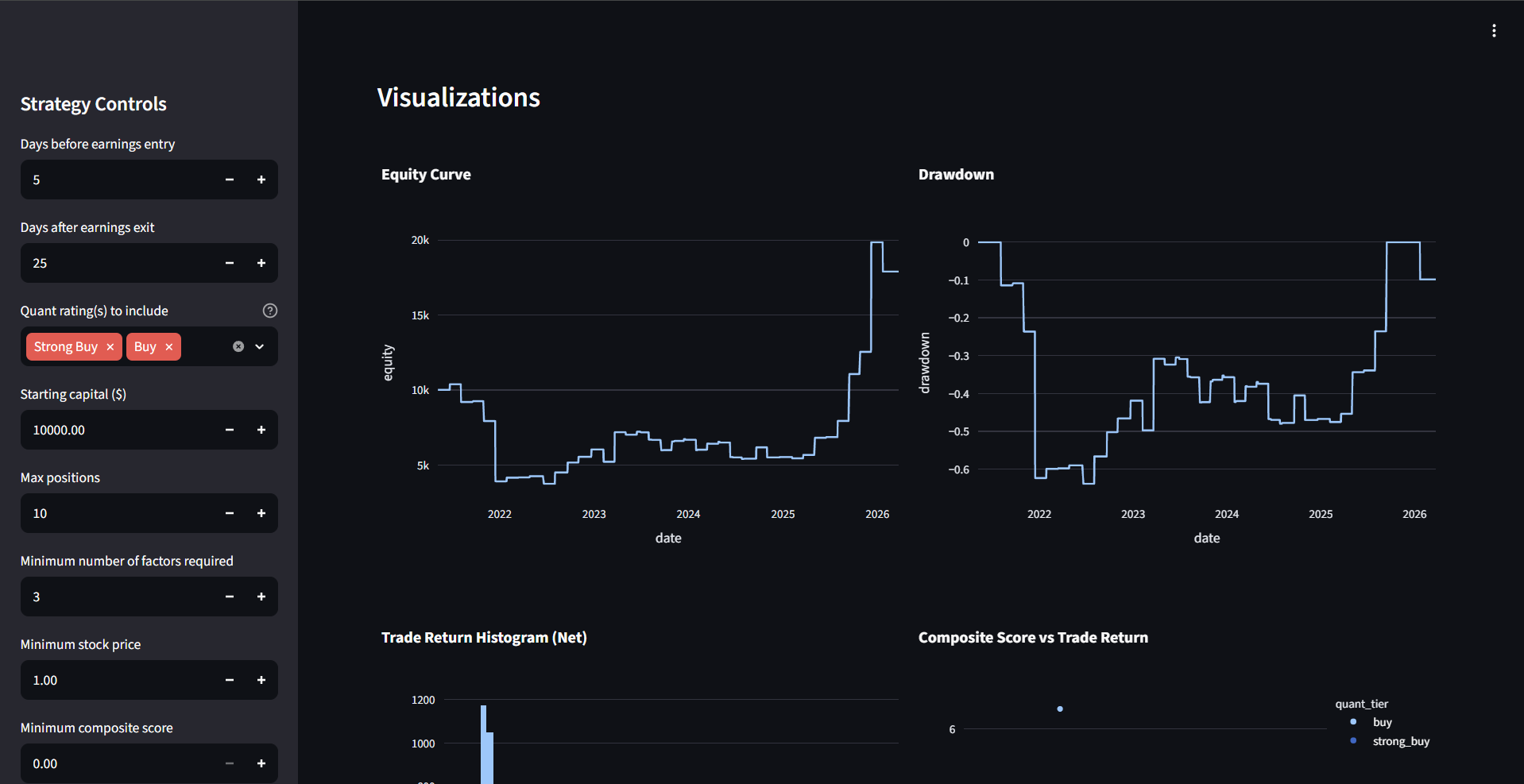
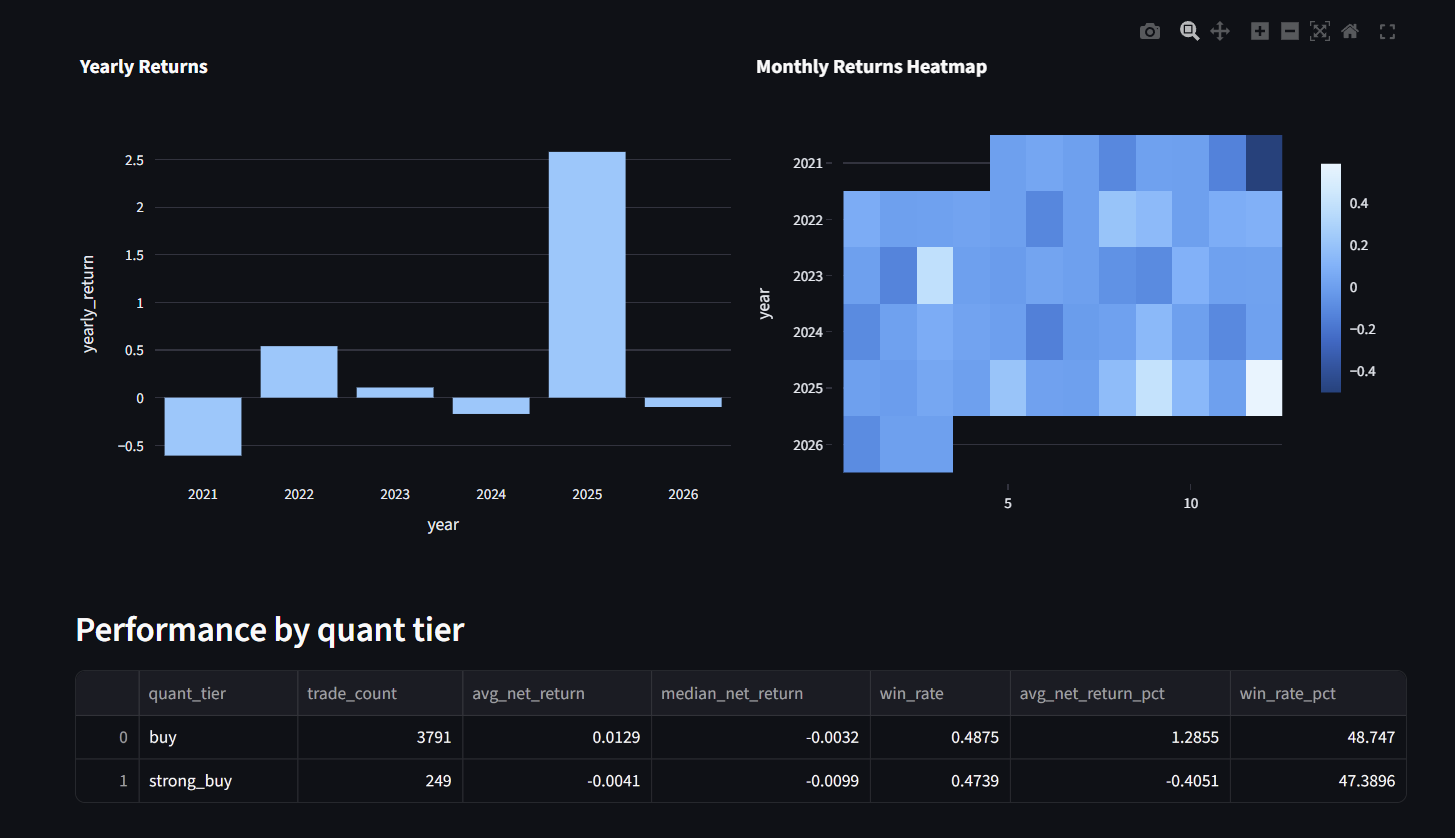
One year produces almost all of it. Broken out by calendar year, 2021 is a large loss, 2022 and 2023 are modest, 2024 and 2026 are slightly negative, and 2025 returns over 250% on its own. Strip that single year out and the strategy is a loser. A result that depends entirely on one year out of six is a description of that year, not an edge.
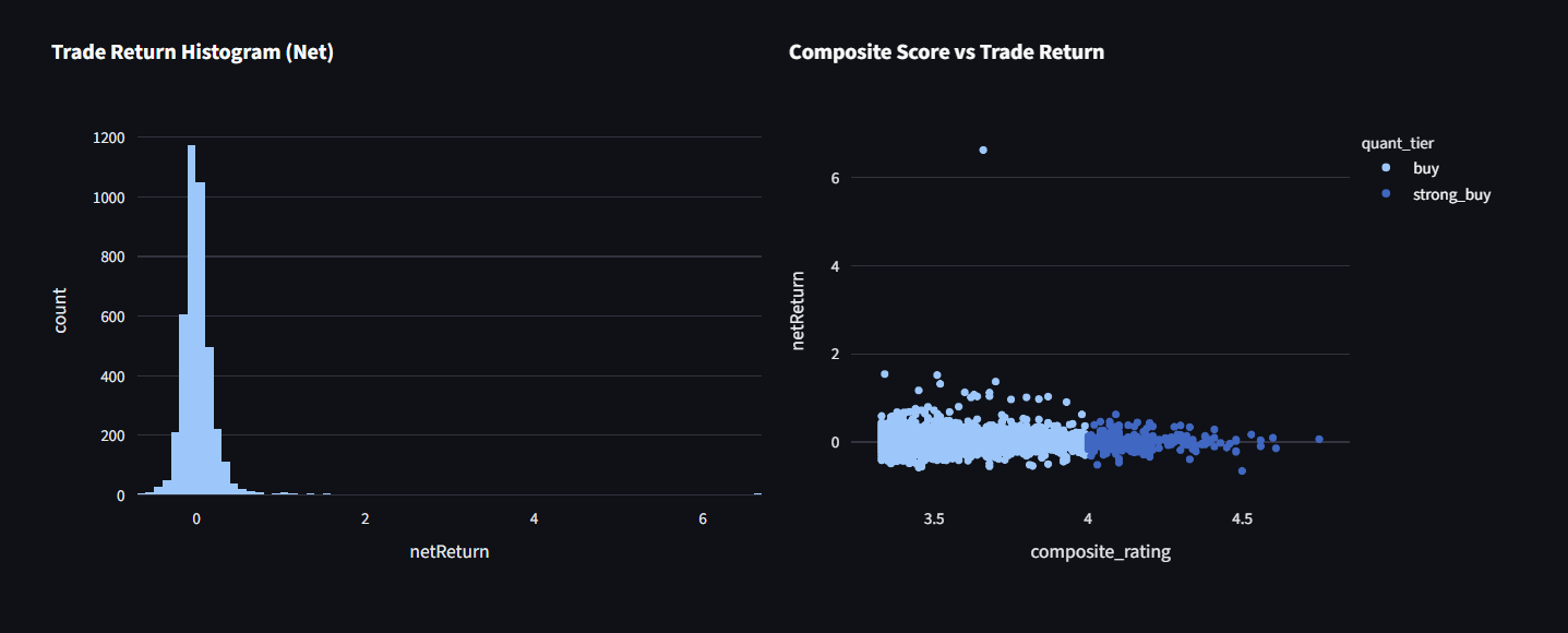
The average trade is positive and the median trade is not. Average net return per trade is 1.18%. The median is −0.35%. Win rate is 48.66%. The distribution is a tight cluster of small losses with a thin tail of very large winners running past 600%. That shape means the strategy is not producing a consistent advantage. It is buying a lottery ticket several thousand times and getting paid by a handful of them.
The direct test of the hypothesis comes out negative. The whole premise was that filtering by company quality improves outcomes. The dashboard splits results by quant tier, so the stricter filter can be measured against the looser one:
| Tier | Trades | Avg net return | Median | Win rate |
|---|---|---|---|---|
| Buy | 3,791 | +1.29% | −0.32% | 48.75% |
| Strong Buy | 249 | −0.41% | −0.99% | 47.39% |
The more selective tier performs worse on every measure. Being pickier about company quality did not improve the outcome. It made it slightly worse.
The composite score has no relationship to trade return. Plotting every trade’s composite rating against its net return produces a flat cloud. Across the full range of scores the return distribution barely shifts. Whatever the six factors are measuring, it is not something that predicts what happens to the stock after it reports.
I kept the result. The easy move here is to keep adjusting parameters until the equity curve points up, screenshot that, and put it on a website. This run does point up, which makes it more tempting rather than less. But a positive number produced by one lucky year and a handful of outlier trades is not a finding, and reporting it as one would be dishonest. The factor composite does not predict post-earnings returns in this test.
The infrastructure is the reusable part. The ingestion, scoring, point in time discipline, and portfolio simulation are all independent of this particular hypothesis. A different idea can be tested by swapping the factors and rerunning.
Running it
I built an interactive dashboard that exposes every strategy parameter, entry and exit windows, factor filters, position limits, transaction costs, and stop losses, and recomputes the whole backtest live. It renders the equity curve, the drawdown, the distribution of trades, returns by year and month, and the performance split by tier on each run.
Being able to change one input and see the whole result recompute is what made the finding above visible. Tightening the quality filter and watching performance get worse is not something you notice in a static report.
It runs on a Linux server I set up and maintain, kept alive as a background service so it stays up on its own, and reachable over a private network rather than exposed to the internet. Link available on request.
I also had to make it fast. The original simulation scanned the full dataset once per ticker and once per date, which made the dashboard unusable for live parameter changes. I restructured those lookups and replaced the row by row loop with a faster iteration method. Before committing it, I verified the optimized version produced numerically identical results to the original across every configuration, since a performance fix that silently changes your numbers is worse than a slow backtest.
What I would do differently
There is no benchmark in this test. The strategy is long-only and the one year that carries the result was a strong year for the market. Without comparing against buying and holding an index over the same window, I cannot separate whatever edge the factors might have from simply being invested. That comparison is the first thing I would add, and it would probably shrink the headline number further.
The Strong Buy sample is thin. 249 trades is enough to be suggestive and not enough to be conclusive. The tier comparison points in a clear direction, but I would want considerably more of them before treating the underperformance as established rather than likely.
The factor scores are static. They rank a company against its peers at a moment in time but say nothing about whether the market has already priced that in, which is the most likely reason the composite has no predictive power here. A version that measured surprise, meaning the gap between what was expected and what was reported, would be a more honest test of the underlying idea.
I am currently rebuilding the system to make the strategy logic modular, so new hypotheses can be tested without rewriting the pipeline each time.